Guidelines
How the 441 icons are named, drawn, sized, and colored. The measurements below come from specific glyphs. They are not one token that every icon follows.
Naming
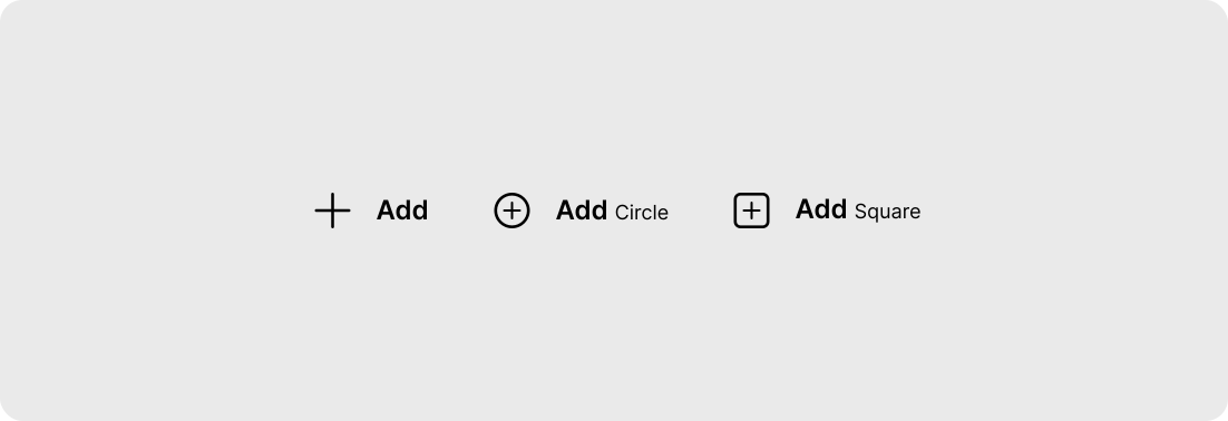
The slug is kebab-case. The name segment has no underscores. Source files live under
a category folder, then svg/.
assets/Local language/svg/ic_refineui_local-language_24_regular.svg
Pattern: assets/{Category}/svg/ic_refineui_{slug}_{size}_{regular|filled}.svg.
Regular and filled are two styles of the same slug. In the icon fonts they share a
codepoint across two files. That is intentional. Same-style names do not collide.
| Platform | Identifier |
|---|---|
| Slug, metadata, CDN | local-language |
| React · React Native · Web | LocalLanguage / LocalLanguageFilled |
| iOS | .localLanguage24Regular |
| Android | @drawable/ic_refineui_local_language_24_regular |
| Flutter | RefineUIIcons.local_language_24_regular |
| CDN path | icons/24/local-language-regular.svg |
Stroke
Draw a filled shape, not an SVG stroke. Across every regular 24px file, nothing paints
a stroke. panel-left sets stroke="none", which draws nothing.
Holes, including Accessibility, are cut with fill-rule="evenodd".
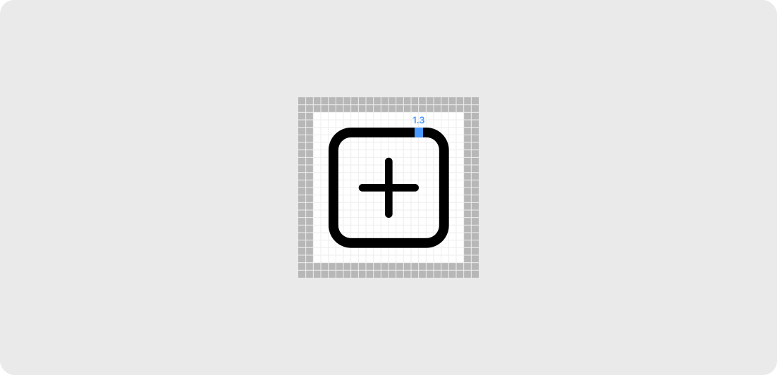
At 24px the weight is 1.3. Square's outline is that band: the outer edge sits at 4 and the inner edge at 5.3. From 20px up, the same Square outline scales with the artboard, size times 1.3 / 24. At 16px it is 0.65, tighter than that ratio. There is no Square at 12px, so 12 is not in the table. Do not use 1.5.
| Size | Stroke |
|---|---|
16 | 0.65 |
20 | 1.083 |
24 | 1.3 |
28 | 1.517 |
32 | 1.733 |
48 | 2.6 |
Corner radius
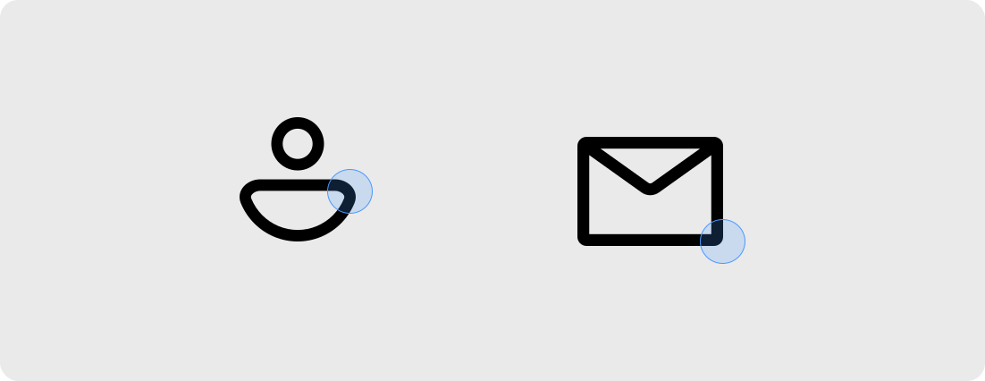
Corner radius is per glyph. There is no Square asset at 12px, so that size is omitted. From 20px up, the outer corner of Square regular is the size divided by 12. At 16px it is 1, which is tighter than 16/12.
| Size | Square outer radius |
|---|---|
16 | 1 |
20 | 1.667 |
24 | 2 |
28 | 2.333 |
32 | 2.667 |
48 | 4 |
The same glyph can carry two radii. The inner edge of the Square 24 ring has radius 0.7. Add-square is not Square. Its outer radius, on the sizes that were measured, is 2 at 16, 3 at 24, 4 at 32, and 6 at 48. 20 and 28 were not measured.
| Size | Add-square outer radius |
|---|---|
16 | 2 |
24 | 3 |
32 | 4 |
48 | 6 |
Size
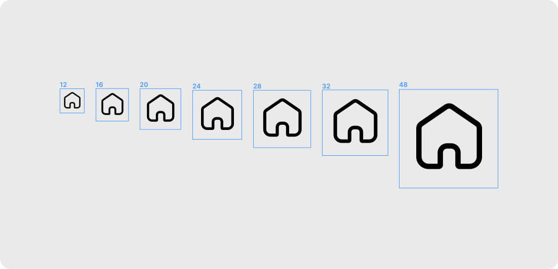
The component size prop defaults to 24 and accepts 16, 20, 24, 28, 32, 48.
Use the file drawn for that size. Scaling a 24px glyph in CSS will not match the weight
or the corner that was drawn for another size.
12px ships in React, React Native, web, iOS, and Flutter. It is not in the CDN or Android packages. Android is also missing 7 icons: button, form, navigation, panel-left, task-list, weather-sunny-high, weather-sunny-low.
| Platform | Sizes |
|---|---|
| React | 12, 16, 20, 24, 28, 32, 48 |
| React Native | 12, 16, 20, 24, 28, 32, 48 |
| Web | 12, 16, 20, 24, 28, 32, 48 |
| CDN | 16, 20, 24, 28, 32, 48 |
| iOS | 12, 16, 20, 24, 28, 32, 48 |
| Android | 16, 20, 24, 28, 32, 48 |
| Flutter | 12, 16, 20, 24, 28, 32, 48 |
Theme
The set is one color. Painted fills in the source SVGs are black (black,
and #000000 on panel-left). React, React Native, and web
default color to currentColor, so the icon follows the text
around it. iOS imagesets are template images. Android vectors are black fills so the
app can tint them. Do not add a second color to a glyph.
The light and dark toggle on this site only changes the page. It stores refineui-docs-theme and sets data-theme. Icons still inherit
the current text color. There is no separate dark glyph.